The “Users Are in Control” principle requires that the EHR should give users the impression that the system is completely controllable.
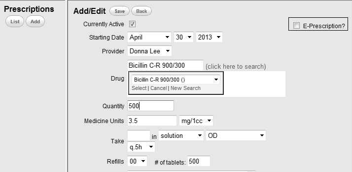
Users are initiators of, not responders to, actions. Actions should result from explicit user requests. A typical bad example that goes against this rule is the inappropriate use of AutoFill. As shown in the prescription page (see Figure 1.), when a physician fill in the drug Bicillin, other information regarding this drug such as quantity, medicine unites and the way of giving medication is automatically filled. However, these items may vary greatly according to specific patients in the clinical setting. The physician has to check every item and make corresponding corrections. This inappropriate use of AutoFill will bring inconvenience to users. A good design should provide users the option to turn on or turn off the AutoFill function.
 |
Figure 1:
In this bad example, once the drug is filled, corresponding parameters are automatically filled. This inappropriate use of AutoFill functionality can lead to the feeling in the user that he\she is the responder to system actions. |
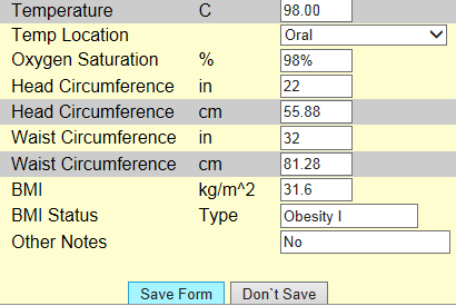
In order to make users to be the controller, the EHR should avoid surprising actions or unexpected outcomes. When dynamically displaying information, the system should also provide informative information as well as associated controls to facilitate user actions. For example, when a clinician fills a number that is out of the normal range, a reminder should pop up for the user to decide to refill or ignore it. Figure 2 shows a typical bad example of this. As we can see the user fills the temperature with an extremely lager number. The “Save Form” button turns blue, which indicates the information cannot be saved. However, the system does not give any reminder of this. The user may feel confused about how to proceed.
 |
Figure 2: In this bad example, the entered information cannot be saved due to the obviously incorrect entry of the temperature. But the system provides no explanatory information regarding this, which may make the user feel confused how to proceed. |
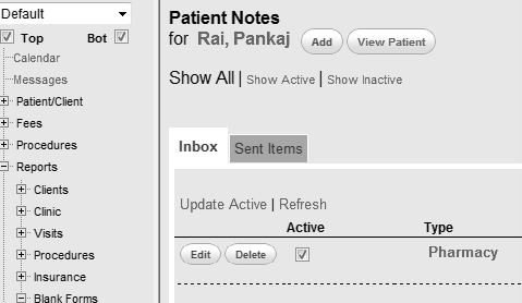
Besides control to system actions, users should have control to their position and status within the EHR. This means users are able to go back or forward freely for their own needs. A good example of achieving this is the use of clickable navigation. For example, below, users can choose the part they want to finish or refer to by clicking the navigation panel on the left side (see Figure 3).
 |
Figure 3:
In this good example, the system provides a navigation panel on the left of the screen, which enables the user to control their position freely. |
Users’ freedom to act out of their convenience is also an important aspect of “Users are in control” guideline. The EHR should provide user functionalities to control for convenience. For example, unit transition is common in clinical settings. A physician may prescribe one medicine in mg, while prescribe another in mg/1cc. Therefore the system should support selection of medicine units for different cases. Below is a bad example of this (see Figure 4). Medicine unit in this system is fixed at mg. If the physician wants to make prescription in other units, he has to do the conversion by hand. Clearly, this system does not give users convenient controls.
 |
Figure 4;
In this bad example, the system fixes the medicine units in “mg”, which bring inconvenience when the user wants to enter in other units. |
[1] Nielsen J. 113 design guidelines for homepage usability. 2001; Available from:www.nngroup.com/articles/113-design-guidelines-homepage-usability.
[2] U.S. Dept. of Health and Human Services. The Research-Based Web Design & Usability Guidelines, Enlarged/Expanded edition. Washington: U.S. Government Printing Office, 2006. Available from: https://www.usability.gov/.
[3] Microsoft. Microsoft Health Common User Interface design guidance. 2012; Available to download from: https://archive.codeplex.com/?p=mscui. (Design Guidance - Find a Patient PDF).
[4] Lowry SZ, Quinn MT, Ramaiah M, Brick D, Patterson ES, Zhang J, et al. A human factors guide to enhance EHR usability of critical user interactions when supporting pediatric patient care. The National Institute of Standards and Technology; 2012.