Always provide help when needed.
Display. Display sufficient instructional information, such as recommended dose, in a directly usable format. Mitigate the potential for incorrect actions to be taken by presenting carefully selected information and explicit labels to clarify the display and the extent to which it is complete.
 |
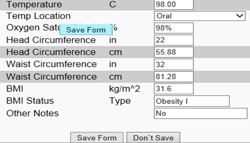
This is a bad example. As we can see the user fills the temperature with an extremely lager number. The “Save Form” button turns blue, which indicates the information cannot be saved. However, the system does not give any reminder of this. The user may feel confused about how to proceed. |
Search function. Give users simple or advanced search functions according to context. First, simple searches should be provided on the homepage with an input box. Advanced search should be shown as a link on the home page with templates and search tips provided, unless advanced searches are the norm on the page. The search engine should be able to search for the entire site and provide usable results.
See Also:
Flexibility and efficiency
[1] Nielsen J. 113 design guidelines for homepage usability. 2001; Available from:www.nngroup.com/articles/113-design-guidelines-homepage-usability.
[2] U.S. Dept. of Health and Human Services. The Research-Based Web Design & Usability Guidelines, Enlarged/Expanded edition. Washington: U.S. Government Printing Office, 2006. Available from: https://www.usability.gov/.
[3] Microsoft. Microsoft Health Common User Interface design guidance. 2012; Available to download from: https://archive.codeplex.com/?p=mscui. (Design Guidance - Find a Patient PDF).
[4] Lowry SZ, Quinn MT, Ramaiah M, Brick D, Patterson ES, Zhang J, et al. A human factors guide to enhance EHR usability of critical user interactions when supporting pediatric patient care. The National Institute of Standards and Technology; 2012.