Visibility of System State
NCCD Principles Menu
Visibility of system status indicates that users should be continuously aware of what is going the system is doing or needing through feedback and display of information. Visibility answers user questions as they interact with system interface, like:
- What is the current state of the system?
- What can be done in the current state?
- Where can users go next? and
- What changes have been made after an action with the system?
Examples in electronic health record include:
- Displaying loading, searching or progress indicators as the information loading on the screen to inform the system state
 |
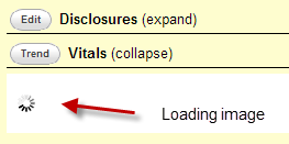
In this good example, an image has been shown as loading information.
|
|
Figure 1, loading image shows as retrieving vitals of a patient in Open EMR.
|
 |
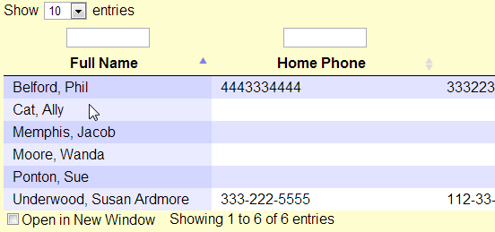
In this bad example, there is no sign what elements on the page are clickable or not.
|
|
Figure 2, a patient list has no clues for further actions.
|
Guidelines summary:
Visibility of links
- Differentiate links and make them scan able. Begin links with the information-carrying word, because users often scan through the first word or two of links to compare them [1] Nielsen’s 34
- Allow link colors to show visited and unvisited states [1] Nielsen’s 37
- Use a clickable ‘list of contents’ on long pages [2] Usability.gov 7:3
- Designate used links [2] Usability.gov 10:7
Visibility regarding navigation
- Locate the primary navigation area in a highly noticeable place, preferably directly adjacent to the main body of the page [1] Nielsen’s 40
- Group items in the navigation area so that similar items are next to each other [1] Nielsen’s 41
- Use site maps [2] Usability.gov 7:10
- Breadcrumb navigation [2] Usability.gov 7:12
- Place primary navigation menus in the left panel [2] Usability.gov 7:5
- Provide navigational options [2] Usability.gov 7:1
- Provide feedback on user’s location [2] Usability.gov 7:4
- Present tabs effectively [2] Usability.gov 7:7
- Use descriptive tab labels [2] Usability.gov 7:6
Visibility regarding page and content layout
- Show dates and times for time-sensitive information only [1] Nielsen’s 105
- Use appropriate menu types [2] Usability.gov 7:9
- Order elements to maximize user performance [2] Usability.gov 12:1
- Format lists to ease scanning [2] Usability.gov 12:3
Make important things visible for decision making
- Allow users to see their entered data [2] Usability.gov 13:8
- Ensure visibility of chart data and axes. [4] NIST7865 IV-C p.22
- Support custom views with custom time ranges (e.g., 3 months to 6 months). [4] NIST7865 IV-J p.23
- Provide a visually-rich chart of information relevant to, and prioritized for, the administration of drugs [3] CUI p.21
- Display sufficient information for an accurate interpretation of the administration schedule (past, current and planned) and status of administration events within a relevant time interval [3] CUI p.21
- Mitigate the potential for action to be taken without sufficient information by presenting carefully selected information and explicit labels to clarify what information is displayed and the extent to which it is complete [3] CUI p.21
- When dynamically presenting information (such as status information, error messages or warnings), display the information in context and facilitate action where necessary by clearly providing associated controls [3] CUI p.21
- Mitigate the potential for action to be taken without sufficient information by presenting carefully selected information by default, avoiding occlusion and providing clear signposts to further information [3] CUI p.13
- Describe inclusion criteria clearly by providing explicit labels to clarify what information is displayed and the extent to which it is complete [3] CUI p.13
Visibility miscellaneous
- Use graphics to show real content, not just to decorate your homepage [1] Nielsen’s 56
- When doing a refresh, update only content that has actually changed, such as news updates [1] Nielsen’s 98
- Warn of ‘Time Outs’ [2] Usability.gov 2:7
- Provide feedback when users must wait [2] Usability.gov 2:10
- Color-coding and instructions [2] Usability.gov 11:9
SBMI NCCD Guidelines explanation
Please note:The content provided here are intended as guidelines (recommended, but not mandatory) for design and implementation, not as standards (mandatory, minimum requirements).
NCCD Design Principle References
References:
[1] Nielsen J. 113 design guidelines for homepage usability. 2001; Available from: https://www.nngroup.com/articles/113-design-guidelines-homepage-usability.
[2] U.S. Dept. of Health and Human Services. The Research-Based Web Design & Usability Guidelines, Enlarged/Expanded edition. Washington: U.S. Government Printing Office, 2006. Available from: https://www.usability.gov/.
[3] Microsoft. Microsoft Health Common User Interface design guidance. 2012; Available to download from: https://archive.codeplex.com/?p=mscui. (Design Guidance - Find a Patient PDF).
[4] Lowry SZ, Quinn MT, Ramaiah M, Brick D, Patterson ES, Zhang J, et al.A human factors guide to enhance EHR usability of critical user interactions when supporting pediatric patient care. The National Institute of Standards and Technology; 2012.


