It is always better to design interfaces that prevent errors from happening in the first place.
Promote data quality to reduce the occurrence of errors. Anticipate typical user errors. Always provide sufficient instructional information to support data quality and ensure such information is easily visible. For example, normal or recommended range of data should be displayed in default where appropriate or can be easily accessed by users. System must remain stable. Do not permit automatic changes to measurement systems (e.g., lb vs. kg) or replacement of critical threshold following system-wide crush. Any important changes and updates must be notified to users before they act to mitigate the potential errors from unexpected actions.
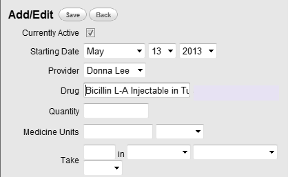
Eliminate error-prone conditions is also important. For example, invalid or inappropriate selection items or entries can be misleading and advance risks of mis-selection and misinterpretation. Figure 1 shows another typical error-prone condition, where the input box is not wide enough for the users to see the entered data. This advances the possibility of selecting wrong drugs with similar names to the desired drug. Any such conditions that could lead to user errors should be considered and avoided in design.
 |
Figure 1:
This example is bad because the input box is not wide enough to see the entered data. |
Ensure automatic check for entered data and provide alerts or reminders for inappropriate data entries to reduce errors. Alerts need to be compatible with, and exist within, the messaging framework. For example, flag that an intended dose is out of normal range. Systems in clinical setting should be able to incorporate alerts into a more complex message structure. Supporting alerts for contraindicated procedures is a good example. Details regarding alert design can be found at Good Error Messages.
[1] Nielsen J. 113 design guidelines for homepage usability. 2001; Available from:www.nngroup.com/articles/113-design-guidelines-homepage-usability.
[2] U.S. Dept. of Health and Human Services. The Research-Based Web Design & Usability Guidelines, Enlarged/Expanded edition. Washington: U.S. Government Printing Office, 2006. Available from: https://www.usability.gov/.
[3] Microsoft. Microsoft Health Common User Interface design guidance. 2012; Available to download from: https://archive.codeplex.com/?p=mscui. (Design Guidance - Find a Patient PDF).
[4] Lowry SZ, Quinn MT, Ramaiah M, Brick D, Patterson ES, Zhang J, et al. A human factors guide to enhance EHR usability of critical user interactions when supporting pediatric patient care. The National Institute of Standards and Technology; 2012.