Scientific studies show that users will click through practically anything if they see it often enough. This is also true for alerts and error messages, even very important ones. The phenomenon of clicking OK or Dismiss without reading the text is called alert fatigue.
Messages should be informative to the user and in a human readable format. The user should be able to understand the nature of error, learn from the message, and recover a specific error. The principle refers to many aspects: phrased in clear language; avoiding obscure codes e.g. system crashed, error code 147; precise and not vague; constructive and polite.
Examples in electronic health record
Messages should constructively help the user solve the problem
 |
In this good example, the message is specific instructing a pre-step that needs to complete prior to the current operation |
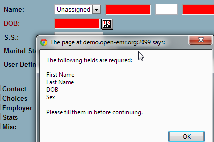
Highlighting where the errors kick in with clear description
 |
In this good example, the fields that are required yet missing are highlighted with red color. |
[1] Nielsen J. 113 design guidelines for homepage usability. 2001; Available from:www.nngroup.com/articles/113-design-guidelines-homepage-usability.
[2] U.S. Dept. of Health and Human Services. The Research-Based Web Design & Usability Guidelines, Enlarged/Expanded edition. Washington: U.S. Government Printing Office, 2006. Available from: https://www.usability.gov/.
[3] Microsoft. Microsoft Health Common User Interface design guidance. 2012; Available to download from: https://archive.codeplex.com/?p=mscui. (Design Guidance - Find a Patient PDF).
[4] Lowry SZ, Quinn MT, Ramaiah M, Brick D, Patterson ES, Zhang J, et al. A human factors guide to enhance EHR usability of critical user interactions when supporting pediatric patient care. The National Institute of Standards and Technology; 2012.