Users should be given prompt and informative feedback about their actions.
Users should be informed of the system status that results from their actions. The system status include:
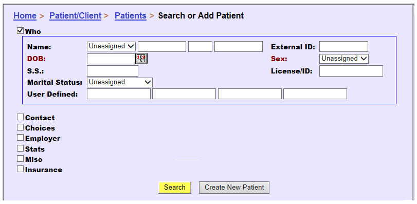
Presenting status information to users facilitates their next actions and should improve operating efficiency. Figure 1 shows an example of providing feedback on users’ location by “breadcrumb” navigation. It presents the user with the information needed to understand where they are in the system and to how perform further actions.
 |
Figure 1:
In this example, the “breadcrumb” navigation serves as a dynamic location indicator to inform users their location within the EHR. |
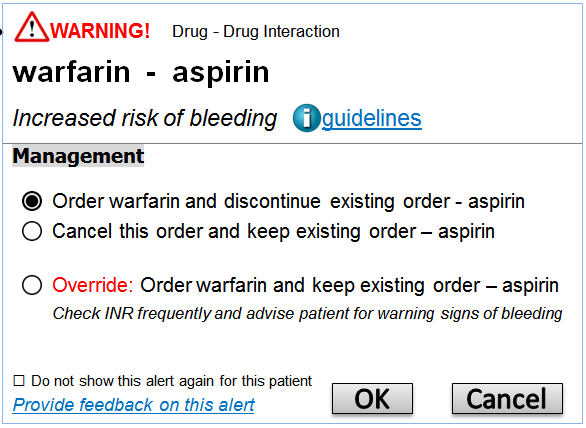
Alerts are an important type of feedback that should be given by the system when users’ actions are incorrect or have good likelihood of causing errors. The appropriate use of alerts can greatly reduce the potential of errors. The representation of alerts should follow "Good error messages” principles. Whenever presenting alerts, make sure the messages are expressed in plain language, precisely indicate the problem, and constructively suggest a solution. Figure 2 shows a good example of alert, which succinct reason for the alert, as well as a list of actions to respond to the alert.
 |
Figure 2: In this good feedback example, the user who orders warfarin for a patient who is already taking aspirin is given an alert warning about the warfarin-aspirin interaction. The rationale for the alert and action choices are also enumerated. |
[1] Nielsen J. 113 design guidelines for homepage usability. 2001; Available from:www.nngroup.com/articles/113-design-guidelines-homepage-usability.
[2] U.S. Dept. of Health and Human Services. The Research-Based Web Design & Usability Guidelines, Enlarged/Expanded edition. Washington: U.S. Government Printing Office, 2006. Available from: https://www.usability.gov/.
[3] Microsoft. Microsoft Health Common User Interface design guidance. 2012; Available to download from: https://archive.codeplex.com/?p=mscui. (Design Guidance - Find a Patient PDF).
[4] Lowry SZ, Quinn MT, Ramaiah M, Brick D, Patterson ES, Zhang J, et al. A human factors guide to enhance EHR usability of critical user interactions when supporting pediatric patient care. The National Institute of Standards and Technology; 2012.