Consistency and Standards
Consistency and standards in design
Users should not have to wonder whether different words, situations, or actions mean the same thing. Standards and conventions in product design should be followed.
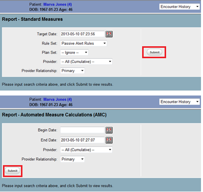
One important aspect involves the consistent display of information. This requires that the system dependably use standard formats, fonts, line spacing, letter spacing and page lengths when displaying relevant information. The same information should appear in fixed places across all screens. Figure 1 shows a bad example of position related to consistency. Here the “submit” button is displayed in different places on different screens within the same task.

Figure 1. Inconsistent placement of controls.
This is a bad example because the “Submit” button appears in different places when filling the report.
The system should also to use consistent language. Some terminology and languages are widely used in the clinical settings or pre-existing clinical applications. Make sure they do not have different meanings in the EHR. Otherwise, users may have incorrect understanding of displayed information and act erroneously.
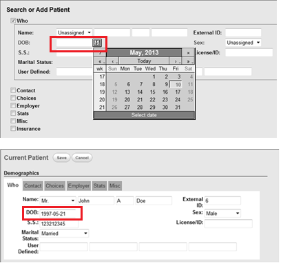
In addition to consistent display of information, another important point is to offer consistent user-system interactions. For example, the data input method and process, as well as corresponding assistant functionalities (e.g., filtering, sorting, and alerting etc.) should be standardized and remain consistent. That uniformity will potentially accelerate operation processes as the user repeatedly interacts with the system. Figure 2 shows an example that goes against this rule.

Figure 2. A bad example of consistent system interaction.
This is a bad example of consistent interaction. This system provides clickable function to choose a date when filling the DOB of a new patient. But it does not provide this function when editing DOB of a current patient.
Guidelines summary:
Interaction
Color (categorization)
- Ensure visual consistency. [2] Usability.gov 11:4
- Label data entry fields consistently. [2] Usability.gov 13:3
Layout and position (spatial consistency)
Font, capitalization
- Format common items consistently. [2] Usability.gov 11:2
- Ensure visual consistency. [2] Usability.gov 11:4
- Use consistent capitalization and other style standards. [1] Nielsen’s 20
- Label data entry fields consistently. [2] Usability.gov 13:3
- Use familiar fonts [2] Usability.gov 11:7
Terminology and language
- Don't use made-up words for category navigation choices. [1] Nielsen’s 44
- Don't use clever phrases and marketing lingo that make people work too hard to figure out what you're saying. [1] Nielsen’s 19
- Use standard abbreviations Don't abbreviate further, such as "p." [1] Nielsen’s 108
- Label data entry fields consistently. [2] Usability.gov 13:3
- Use customer-focused language. [1] Nielsen’s 17
Standards (e.g., blue underlined text for unvisited hyperlinks)
Functionality
- Where appropriate, applying UI standards and conventions from non-clinical application software to the design of clinical applications. [3] CUI (Design Guidance - Filtering Sorting and Grouping) p.8
- Use a single data entry method. [2] Usability.gov 13:13
- Eliminate horizontal scrolling. [2] Usability.gov 8:1
- Use paging rather than scrolling. [2] Usability.gov 8:4
- Avoid horizontal scrolling at 1024x768. [1] Nielsen’s 65
- Display information in a directly usable format. [2] Usability.gov 2:8
- Start numbered items at one. [2] Usability.gov 12:7
- Use check boxes to enable multiple selections. [2] Usability.gov 13:15
- Display default values. [2] Usability.gov 13:18
- Place cursor in first data entry field. [2] Usability.gov 13:19
- Use open lists to select one from many [2] Usability.gov 13:21
- Provide auto-tabbing functionality. [2] Usability.gov 13:24
- Designate used links. [2] Usability.gov 10:7
- Make upper- and lowercase search terms equivalent. [2] Usability.gov 17:3
Format
- Set appropriate page lengths [2] Usability.gov 6:10
- Use moderate white space. [2] Usability.gov 6:11
- Choose appropriate line lengths. [2] Usability.gov 6:12
- Limit font styles and other text formatting, such as sizes, colors, and so forth on the page because over-designed text can actually detract from the meaning of the words. [1] Nielsen’s 63
- Use black text on plain, high-contrast backgrounds. [2] Usability.gov 11:1
- Use at Least 12-point font. [2] Usability.gov 11:8
- Use non-breaking spaces between words in phrases that need to go together in order to be scannable and understood. [1] Nielsen’s 23
- Use all uppercase letters sparingly or not at all as a formatting style. [1] Nielsen’s 27
- Capitalize first letter of the first word in lists. [2] Usability.gov 12:9
- Use bold text sparingly. [2] Usability.gov 11:5
Terminology and language
- Display units accurately in standard notation. [4] NIST7865 IV-D p.22
- Use unique patient identification numbers that are not based upon social security numbers. [4] NIST7865 I-A p.15
- Spell out abbreviations, initializes, and acronyms, and immediately follow them by the abbreviation, in the first instance. [1] Nielsen’s 25
- Spell out the month, or use month abbreviations, not numbers. [1] Nielsen’s 109
- Define acronyms and abbreviations. [2] Usability.gov 15:4
- Use active voice. [2] Usability.gov 15:9
- Avoid exclamation marks. [1] Nielsen’s 26
Layout and position
- Include age, gender, and weight on constant-identification banner headers on all screens. [4] NIST7865 I-C p.15
- Put labels close to data entry fields. [2] Usability.gov 13.7
- Use appropriate menu types. [2] Usability.gov 7.9
- Optimize display density. [2] Usability.gov 6.6
SBMI NCCD Guidelines explanation
Please note:The content provided here are intended as guidelines (recommended, but not mandatory) for design and implementation, not as standards (mandatory, minimum requirements).
NCCD Design Principle References
References:
[1] Nielsen J. 113 design guidelines for homepage usability. 2001; Available from:www.nngroup.com/articles/113-design-guidelines-homepage-usability.
[2] U.S. Dept. of Health and Human Services. The Research-Based Web Design & Usability Guidelines, Enlarged/Expanded edition. Washington: U.S. Government Printing Office, 2006. Available from: https://www.usability.gov/.
[3] Microsoft. Microsoft Health Common User Interface design guidance. 2012; Available to download from: https://archive.codeplex.com/?p=mscui. (Design Guidance - Find a Patient PDF).
[4] Lowry SZ, Quinn MT, Ramaiah M, Brick D, Patterson ES, Zhang J, et al. A human factors guide to enhance EHR usability of critical user interactions when supporting pediatric patient care. The National Institute of Standards and Technology; 2012 .


