Minimize Memory Load
Reducing memory load means that users should not be required to memorize (or recall out of their heads) a great deal of information to carry out tasks. Memory load reduces users’ capacity to perform the main task. There are many instances where a user’s memory load can be reduced, such as
- recognition rather than recall (e.g., menu vs. commands);
- externalize information through visualization;
- hierarchical structure;
- default values;
- concrete examples (DD/MM/YY, e.g., 10/20/99) and
- generic rules and actions (e.g., drag objects).
Examples include:
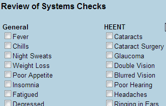
Recognition is easier than recall
 |
Figure 1:
This example illustrates the use of checklist in EHR. User traverses the predefined items and selects the proper ones, which is simpler than describing all upon recall efforts
|
Use concrete examples
 |
Figure 2:
This is a bad example. No specification or example about the format is given, as typing in the date of birth.
|
Guidelines Summary:
- Spell out abbreviations, initializes, and acronyms, and immediately follow them by the abbreviation, in the first instance [1] Nielsen’s 25
- Locate the primary navigation area in a highly noticeable place, preferably directly adjacent to the main body of the page [1] Nielsen’s 40
- The most critical page elements should be visible "above the fold" (in the first screen of content, without scrolling) at the most prevalent window size [1] Nielsen’s 66
- Include a short description of the site in the window title [1] Nielsen’s 75
- Reduce the user’s workload [2] Usability.gov 2:4
- Design for working memory limitations [2] Usability.gov 2:5
- Do not use color alone to convey information [2] Usability.gov 3:3
- Provide feedback on user’s location [2] Usability.gov 7:4
- Keep navigation-only pages short [2] Usability.gov 7:8
- Breadcrumb navigation [2] Usability.gov 7:12
- Provide consistent clickability cues [2] Usability.gov 10:8
- Label data entry fields clearly [2] Usability.gov 13:5
- Allow users to see their entered data [2] Usability.gov 13:8
- Label units of measurement [2] Usability.gov 13:16
- Define acronyms and abbreviations [2] Usability.gov 15:4
- Ensure that necessary information is displayed [2] Usability.gov 16:3
- Notify users when multiple search options exist [2] Usability.gov 17:7
- Include photographs of newborns with primary caregivers for patient identification. [4] NIST7865 I-B p.15
- Include age, gender, and weight on constant-identification banner headers on all screens. [4] NIST7865 I-C p.15
- Distinguish between newly generated and copied information. [4] NIST7865 I-D p.16
- Display the recommended dose range for the selected mg/kg dose. [4] NIST7865 II-H p.18
- Display normal ranges for medication doses and lab values based upon weight, height, body surface area, body mass index, and age information. [4] NIST7865 III-E p.21
- Display together parameters that are continuously monitored to rapidly intervene. [4] NIST7865 III-F p.22
- Describe inclusion criteria clearly by providing explicit labels to clarify what information is displayed and the extent to which it is complete [3] CUI (Design Guidance - Medications List) p.13
- Displaying core information according to existing standards and guidance and using a minimum data set available to clinical applications [3] CUI (Design Guidance - Patient Banner) p.4
- Provide the mechanism for editing a data item as close as possible to its display (direct editing) [3] CUI (Design Guidance - Displaying Adverse Drug Reaction Risks) p.7
Please note:The content provided here are intended as guidelines (recommended, but not mandatory) for design and implementation, not as standards (mandatory, minimum requirements).
References:
[1] Nielsen J. 113 design guidelines for homepage usability. 2001; Available from:www.nngroup.com/articles/113-design-guidelines-homepage-usability.
[2] U.S. Dept. of Health and Human Services. The Research-Based Web Design & Usability Guidelines, Enlarged/Expanded edition. Washington: U.S. Government Printing Office, 2006. Available from: https://www.usability.gov/.
[3] Microsoft. Microsoft Health Common User Interface design guidance. 2012; Available to download from: https://archive.codeplex.com/?p=mscui. (Design Guidance - Find a Patient PDF).
[4] Lowry SZ, Quinn MT, Ramaiah M, Brick D, Patterson ES, Zhang J, et al. A human factors guide to enhance EHR usability of critical user interactions when supporting pediatric patient care. The National Institute of Standards and Technology; 2012.


