Any extraneous content is a distraction and a slow-down, which should be avoided to facilitate efficient action.
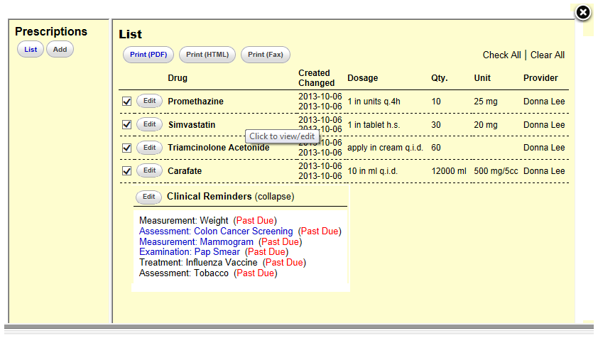
The EHR should only present information that is needed by users. Displaying too much irrelevant information may distract users and therefore diminish the relative visibility of important information. As shown in figure 1. The user who looks for prescription information is also presented with clinical reminders. Even though the clinical reminders are important information of a patient, they have nothing to do with the user’s original task. Including this information in the prescription list may confuse the user and slow down further actions.
 |
Figure 1:
In this bad example, the user is looking for prescription information regarding a patient. This page provides this information, but also presents clinical reminders of this patient, which is extraneous to the user’s original task. |
For the display of necessary information, ensure the simplicity of information representation to enhance readability. Minimize the number of words in sentences, and the number of sentences in paragraphs. Make sure the display density is also optimized to facilitate finding target information.
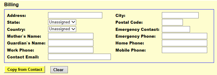
In addition to the minimum information representation, the “Minimalist” principle also involves the minimum system interaction. Including interactions unrelated to current tasks (e.g. irrelevant tools) is not an efficient design and tends to distract the user from task-relevant interactions. Any task should require as few system interactions as possible. Additional ones not only slow down user actions but also advance the possibility of errors. Figure 2 shows a good example of minimizing system interactions, which introduces “Copy from Contact” button to avoid data re-entry if the billing information is the same as that in contact information. This improves system efficiency, as well as potentially reduces the likelihood of user errors.
 |
Figure 2:
In this good example, clicking “Copy from Contact” button will prompt the server to copy information from contact address to billing address, thus eliminating the need for users to re-input the data if it is the same. |
[1] Nielsen J. 113 design guidelines for homepage usability. 2001; Available from:www.nngroup.com/articles/113-design-guidelines-homepage-usability.
[2] U.S. Dept. of Health and Human Services. The Research-Based Web Design & Usability Guidelines, Enlarged/Expanded edition. Washington: U.S. Government Printing Office, 2006. Available from: https://www.usability.gov/.
[3] Microsoft. Microsoft Health Common User Interface design guidance. 2012; Available to download from: https://archive.codeplex.com/?p=mscui. (Design Guidance - Find a Patient PDF).
[4] Lowry SZ, Quinn MT, Ramaiah M, Brick D, Patterson ES, Zhang J, et al. A human factors guide to enhance EHR usability of critical user interactions when supporting pediatric patient care. The National Institute of Standards and Technology; 2012.