The image of the system perceived by users should match the model the users have about the system.
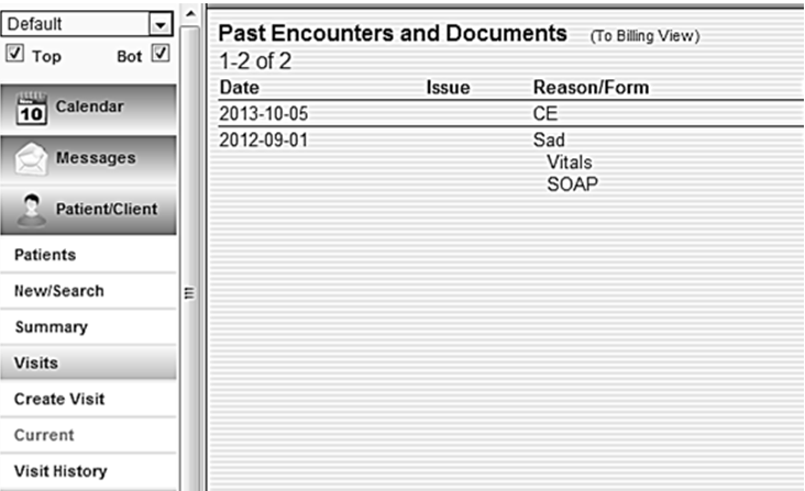
Place items and display information consistently. The items in the system should be placed according to existing standards and guidance in the real world as well as to facilitate users’ performance. For example, the primary menu should be placed in the left. First, it is a convention to have the primary menu on the left. Second, placing the primary menu on the left helps to maximize users’ performance. On the other hand, the information should be displayed in a standard way that conforms to the reality. For instance, units should be displayed in a standard way to conform to users’ clinical work.
 |
Figure 1:
This is a good example. Primary navigation menus is placed on the left as shown in the picture. Users preferred having the primary menu in the left panel. By placing the menu on the left the display matches users’ needs and expectation in the real world. |
Conform to the systems and practice of the users. First, systems should be designed for popular operating systems. For example, systems designs should be based on the requirements of the primary operating systems people are using. The connection speed in different institutions should also be put into account. On the other hand, system designs should conform to best practice and existing standards. For example, the key design principles from the paper drug charts can be transferred to the system to reduce the need for training and increase familiarity when users move to electronic systems
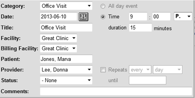
Use users’ language. Use familiar and consistent terminology, ensure that items are distinct from one another, use consistent and concise phrasing. Use customer-focused language and standardized abbreviations. Do not use jargons, marketing lingos and smart phrases.
 |
Figure 2:
This is a bad example because the system uses P. as the abbreviation of P.M., which makes it difficult to understand. |
See Also:
Consistency and standards; Use users’ language
[1] Nielsen J. 113 design guidelines for homepage usability. 2001; Available from:www.nngroup.com/articles/113-design-guidelines-homepage-usability.
[2] U.S. Dept. of Health and Human Services. The Research-Based Web Design & Usability Guidelines, Enlarged/Expanded edition. Washington: U.S. Government Printing Office, 2006. Available from: https://www.usability.gov/.
[3] Microsoft. Microsoft Health Common User Interface design guidance. 2012; Available to download from: https://archive.codeplex.com/?p=mscui. (Design Guidance - Find a Patient PDF).
[4] Lowry SZ, Quinn MT, Ramaiah M, Brick D, Patterson ES, Zhang J, et al. A human factors guide to enhance EHR usability of critical user interactions when supporting pediatric patient care. The National Institute of Standards and Technology; 2012.